Manchmal ist es am einfachsten, simple „Webanwendungen“ zur Dateneingabe mit den Pentaho-Dashboards zu entwickeln. (RapidMiner hat vor einiger Zeit ähnliche Funktionen in den Server eingebaut, um statt nur Dashboards echte Webapps entwickeln zu können.)
Eine wichtige Rolle spielt hierbei die Button-Komponente. Mit ihr kann man die Eingabe abschießen und z. B. mit einer Kettle-Transformation die Daten verarbeiten.
Normalerweise ist das Zusammenspiel zwischen Dashboard-Parametern, Komponenten-Parametern und Datenquellen-Parametern ziemlich simpel und logisch, aber in dieser Konstellation kann es kompliziert werden, insbesondere wenn die Dashboard-Parameter auch noch anders heißen als die Parameter der Transformation.
In diesem Beispiel legen wir die Simple Parameters Param1, Param2 und Parameter3 im Dashboard an, und in der PDI-Transformation die Parameter Param1, Param2 und Param3. Sie bekommen entsprechende Default-Werte, damit wir sie im Output unterscheiden können. Parameter3 ist im Dashboard absichtlich anders benannt.
Wir legen eine Datenquelle vom Typ „kettle over kettleTransFromFile“ an und wählen die Transformationsdatei aus. Der Name eines Schrittes der Transformation wird unter „Kettle Step name“ festgelegt. Unter Variables geben wir die Namen der in der Transformation definierten Parameter (also Param1, Param2, Param3) ohne Value an (also bleiben alle Value-Felder leer). Unter Parameters wiederholen wir diese drei Namen, und als Value geben wir die gleichen Namen nochmal ein. (Also: Param1/Param1, Param2/Param2, Param3/Param3.)
Wichtig ist jetzt das korrekte Einstellen der Button-Komponente. Unter Advanced Properties wird zuerst „Action Datasource“ auf den Namen der Datenquelle gesetzt, und dann die Action Parameters eingegeben. Hier geben wir unter Arg die Parameternamen, die die Datenquelle erwartet, ein, also Param1, Param2 und Param3. Als Value aber die Namen der Dashboard-Parameter, also Param1, Param2 und Parameter3. Damit haben wir die Verbindung vom anders benannten Parameter zur Transformation geschaffen.
Pentaho Community Dashboards: The Button component and passing parameters
Sometimes, the easiest way to create a simple „data input web application“ is a Pentaho Dashboard. (RapidMiner put similar functionality into the Server to enable the development of web apps instead of only dashboards.)
The Button component has an important role when building applications: It is an easy way to take the input and call a Kettle transformation (for example) to process the data.
Usually, the interaction between Dashboard parameters, Component parameters and Datasource parameters is quite simple and logical. However, in this situation it can became more complicated, especially if the parameters in the dashboard and in the transformation have different names.
In this example, we create Simple Parameters called Param1, Param2 and Parameter3 in the dashboard, and Param1, Param2, Param3 in the PDI transformation. We assign them different default values so we can distinguish them in the output. Parameter3 is intentionally called differently in the dashboard.
We create the datasource of type „kettle over kettleTransFromFile“ and select the transformation file on the server. The name of one step in the transformation must be entered in „Kettle Step name“. In the Variables input, we enter the transformation parameter names Param1, Param2, Param3 without entering values. (The Value fields must stay empty.) In the Parameters, we enter the same names but this time also in the value fields: Param1/Param1, Param2/Param2, Param3/Param3.
Now it’s important to set up the Button component correctly. In the Advanced Properties, we set the Action Datasource to be the name of the data source, and then enter the Action Parameters. Here, the Arg names are the data source parameter names (Param1, Param2, Param3), and the Value names are the Dashboard parameter names: Param1, Param2 and Parameter3. This is how the link to differently named dashboard parameters is done.
Im Pentaho BI Server ist eine sehr flexible Karten-Komponente enthalten, die leider nicht gerade ausführlich dokumentiert ist. Ich möchte hier eine kurze Anleitung für einen erfolgreichen Start geben.
Zuerst braucht man Positionsdaten. Diese liegen entweder als echte Geodaten (z. B. aus einer GIS-Datenbank wie PostGIS) oder als Breiten- und Längengrad (latitude/longitude) vor. Im Dashboard brauchen wir die lat/lon-Darstellung.
Als erstes legen wir im Layout-Panel des Dashboard-Editors einen Bereich für die Karte an, z. B. eine Zeile und darin eine Spalte, in diesem Beispiel mit einer Breite von 10 Elementen (Medium Devices). Diese Spalte benennen wir so, daß die Verbindung zum Map-Element erkennbar ist, z. B. MapDiv.
Datenquelle
Die Datenquelle für die Punkte auf der Karte definieren wir im Datasources Panel. Hier legen wir eine Abfrage namens MapQuery an, die uns die Geokoordinaten liefert. Diese Spalten müssen „Latitude“ und „Longitude“ heißen (die Klein- oder Großschreibung ist egal).
Hat man echte Geodaten in einer GIS-fähigen Datenbank, sind die Punkte eventuell in einer eigenen Spalte zusammengesetzt gespeichert. Das läßt sich leicht in die benötigten Koordinaten aufspalten:
SELECT ST_X(ST_Transform(geo, 4326)) as longitude,
       ST_Y(ST_Transform(geo, 4326)) as latitude
FROM gis_table
In diesem Beispiel ist „geo“ der Name der Geodaten-Spalte. Mit ST_Transform(geo, 4326) konvertiert PostGIS die Koordinaten aus der in der Datenbank verwendeten Projektion in Länge- und Breitengrad. ST_X und ST_Y extrahieren aus dem konvertierten Objekt die einzelnen Koordinaten.
Karten-Komponente
Jetzt kann das Karten-Element im Components Panel angelegt werden: Custom: NewMapComponent.
Als Name wählen wir in diesem Beispiel einfach „Map“. Als Datasource tragen wir den Namen der Datenquelle (MapQuery) ein, und als HtmlObject den Namen des angelegten Bereichs (MapDiv).
Wenn wir das Dashboard speichern und ausführen, stellen wir fest, daß keine Karte angezeigt wird. Das liegt daran, daß die Karten im Gegensatz zu anderen Elementen selbst keinen Platz beanspruchen. Wir müssen also Breite und Höhe des enthaltenden Elements festlegen, entweder im Layout Panel mit Height, oder in einem Stylesheet.
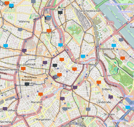
Das Ergebnis der Mühen ist eine Karte, in der die Punkte aus der Datenbankabfrage mit farbigen Standard-Symbolen markiert sind.
Büchereien in Wien – Kartendaten (c) OpenStreetMap contributors
Standardmäßig zeigt die Karte die ganze Erde an. Meist will man aber eine kleinere Region anzeigen. Das geht mit den Optionen Center Latitude und Center Longitude sowie Default Zoom Level.
Die beiden Center-Koordinaten kann man von der Karte ablesen, wenn man mit der Maus über sie fährt. Der Zoom Level hängt von der Größe der Kartendarstellung und dem darzustellenden Gebiet ab. Für eine Großstadt kann der Zoom ca. 12 betragen, Österreich paßt bei Zoom 7 ganz gut, Deutschland braucht schon Zoom 6.
Anpassung der Marker
Die Standard-Markierungen der Punkte auf der Karte passen nicht zu jeder Anwendung. Es besteht die Möglichkeit, eigene Symbole anzuzeigen: dazu gibt man in der Datenquelle die URL zum Symbol (ganz normale Bilddatei) in der Spalte „marker“ aus. Damit lassen sich zum Beispiel unterschiedliche Zustände der dargestellten Objekte anzeigen.
Popups
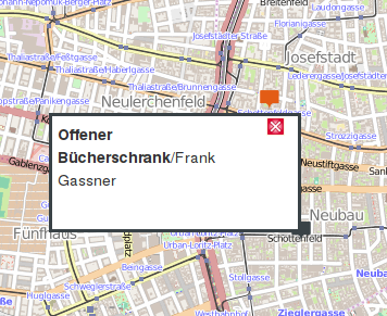
Zu jedem Marker können wir Zusatzinformationen anzeigen lassen. Wenn die Datenquelle eine Spalte „popupContents“ enthält, wird deren Inhalt (optional HTML-formatiert) angezeigt, wenn der Benutzer ein Marker-Symbol anklickt. Mit Popup Width und Popup Height läßt sich die Größe des Popups an den erwarteten Inhalt anpassen.
Beispiel eines formatierten Popups – Kartendaten (c) OpenStreetMap contributors
Mit diesen Optionen läßt sich schon ganz ohne Programmierung viel machen. Mit etwas JavaScript läßt sich noch viel mehr erreichen.
Automatische Aktualisierung der Karteninhalte
Im Gegensatz zu vielen anderen Dashboard-Komponenten bietet NewMapComponent keine Funktion zum automatischen Aktualisieren des Inhalts in festgelegten Abständen. In einigen Fällen möchte man jedoch die Positionen beweglicher Objekte darstellen und die Karte von Zeit zu Zeit automatisch aktualisieren. Glücklicherweise läßt sich das mit ein wenig JavaScript-Code erreichen.
In den Advanced Properties der Karten-Komponente geben wir in der Eigenschaft Post Execution eine Funktion ein:
//Sets up a timer to refresh the map after a minute
function () {
    this.timerId = window.setTimeout(
        function() {
            render_Map.update();
        }
    , 60000);
}
60000 ist die Anzahl der Millisekunden, nach denen der Timer laufen soll. render_Map ist der Name der Karten-Komponente, mit „render_“ davor – so benennt das Community Dashboard Framework das JavaScript-Objekt.
Da diese Funktion immer nach dem Aktualisieren der Karte ausgeführt wird, ist gleich der nächste Timer nach der gleichen Periode aktiviert. Die Timer-ID, die in JavaScript zum Abbrechen des Timer genutzt werden kann, wird dabei im render_Map-Objekt gespeichert.
Es gibt nur ein Problem: Verschiebt der Benutzer den Kartenausschnitt oder zoomt hinein oder hinaus, setzt die Aktualisierung der Karte den Ausschnitt und den Zoom-Wert auf die Standardwerte. Die Karte kehrt also zum Ausgangspunkt zurück. Um das zu vermeiden, können wir vor dem Update noch schnell die aktuelle Sicht abspeichern, wodurch die Karte nicht mehr springt.
Folgende Funktion gehört in die Pre Execution-Eigenschaft:
//Before reloading the map automatically, save the current zoom level and position
function () {
    if (this.timerId != null) {

        //Get current map center and zoom level
        center = this.mapEngine.map.center;
        zoom = this.mapEngine.map.zoom;

        //Transform to WGS84 coordinates
        center.transform(this.mapEngine.map.projection, "EPSG:4326");

        this.defaultZoomLevel = zoom;
        this.centerLongitude = center.lon;
        this.centerLatitude = center.lat;
    }
}
Zuerst überprüfen wir, ob die timerId schon gesetzt ist. Beim ersten Anzeigen der Karte (wenn das Dashboards geöffnet wird) ist das noch nicht der Fall.
Ist die Karte schon fertig dargestellt worden, ist timerId beim nächsten Durchlauf nicht mehr leer, dann können wir also die Position und den Zoom-Level der Karte abfragen und in die Standardeinstellung der Komponente hineinschreiben.
Bei der nächsten automatischen Aktualisierung der Karte tritt zwar ein systembedingtes Flackern auf, aber der vom Benutzer gewählte Bildausschnitt bleibt bestehen.
Die Map-Komponente bietet noch andere Möglichkeiten, so wie das Thema der GIS-Daten ein fast unerschöpfliches ist. Ich werde sicher noch weitere Beiträge in diesem Themenkreis schreiben.
Displaying maps with the Pentaho Dashboard Framework
Pentaho BI Server contains a map component that’s very versatile but unfortunately quite sparsely documented. I’d like to give you a simple introduction into using the component.
First, we need position data. These are either stored in a real geographic database like PostGIS or separated into latitude and longitude. The dashboard map needs the lat/lon form.
First we create an area for the map in the Layout Panel of the Dashboard Editor. This can be a row and a column in it, for example with a width of 10 elements (enter it in the Medium Devices setting). We name this column MapDiv to state that it belongs to the map.
Data source
We need to specify the data source of the points in the Datasources Panel. Here, we enter a query called MapQuery that returns the coordinates. The columns must be called „Latitude“ and „Longitude“ (capitalization doesn’t matter).
Geograpic data in a GIS-capable database stores the points in a single column. It is easy to separate the two coordinates:
SELECT ST_X(ST_Transform(geo, 4326)) as longitude,
       ST_Y(ST_Transform(geo, 4326)) as latitude
FROM gis_table
In this example, „geo“ is the name of the geodata column. In PostGIS, ST_Transform(geo, 4326) converts the coordinates from the geographic reference system used in the database to the classic Earth latitude and longitude values. ST_X and ST_Y extract the longitude and latitude from the compound object.
Map component
Now we create the Map element in the Components Panel by adding a Custom: NewMapComponent.
The name is simply „Map“ in this example. The Datasource is the name of our data source (MapQuery) and the HtmlObject is the name of the created row (MapDiv).
After saving and executing the dashboard, no map is shown. The reason is that the Map component itself doesn’t specify a content height, as other components do. So we need to set the width and height ourselves, either in the Layout Panel (Row Height) or in a stylesheet.
The result is a map that visualizes points from the database query with standard symbols in different colors.
By default, the map shows the entire Earth. We usually want to restrict the displayed area: this is done with the options Center Latitude/Longitude and Default Zoom Level.
The Center coordinates are displayed on the map when moving the mouse over it. The zoom level depends on the size of the map and the area to be shown. For a large city, the zoom can be around 12, Austria fits well with zoom = 7, and Germany requires zoom = 6.
Changing the markers
The default markers of map points aren’t suitable for some requirements. It is possible to use our own symbols: just return the URL of the symbol (a normal image file) in the column called „marker“ in the map data source. This allows us to visualize different object states.
Popups
For each marker we can display additional information in a popup area. If the data source contains a column named „popupContents“, its text (optionally HTML formatted) is displayed when the user clicks on a marker symbol. Popup Width and Popup Height can be changed to match the size of the content to display.
Using these options, we can already do a lot, entirely without programming. A bit of JavaScript can do a lot more.
Periodic updates of the map contents
In contrast to many other dashboard components, the NewMapComponent doesn’t have a setting for periodic updates. Sometimes we have to visualize objects that can move and automatically refresh the map from time to time. Fortunately, only a few lines of simple JavaScript are necessary to achieve this.
We enter the following function in the Advanced Properties of the Map component, in the property Post Execution:
//Sets up a timer to refresh the map after a minute
function () {
    this.timerId = window.setTimeout(
        function() {
            render_Map.update();
        }
    , 60000);
}
60000 is the number of milliseconds after the timer executes the function. The map component is named render_Map in this example: the Community Dashboard Framework always prefixes the specified names with „render_“ to create the JavaScript object in the running dashboard.
This function is executed after each update of the map, so it also sets up the next automatic update after the same period. The timer ID stored in the render_Map object could be used to cancel the timer if desired.
However, there’s one usability problem: If the user moves the map or zooms in, the automatic update resets the map to the values defined in the dashboard properties and the map returns to the initial view. We can avoid this by storing the properties of the current view before the map update, so the map doesn’t jump around anymore.
The following function is entered into the Pre Execution property:
//Before reloading the map automatically, save the current zoom level and position
function () {
    if (this.timerId != null) {

        //Get current map center and zoom level
        center = this.mapEngine.map.center;
        zoom = this.mapEngine.map.zoom;

        //Transform to WGS84 coordinates
        center.transform(this.mapEngine.map.projection, "EPSG:4326");

        this.defaultZoomLevel = zoom;
        this.centerLongitude = center.lon;
        this.centerLatitude = center.lat;
    }
}
The function checks if the timerId is set. If the map is displayed the first time (when opening the dashboard), this is not yet the case.
In a map that is already displayed, the timerId has a value, so we can store the map’s position and zoom level in the properties of the map object.
The map update causes a visible flicker of the dashboard, but at least the map area selected by the user stays as it is.
The map component offers a lot more, and GIS data is an almost infinite topic. This blog post isn’t the last one about maps, that’s for sure.